An insane amount of information bombards us every day. We've gotten kinda used to it, but our attention spans have suffered. The coro...
An insane amount of information bombards us every day. We've gotten kinda used to it, but our attention spans have suffered. The coronavirus has surely escalated it all, and we’re now blindly navigating the labyrinth of facts and fiction. Do we really need to know, like, every-thing?
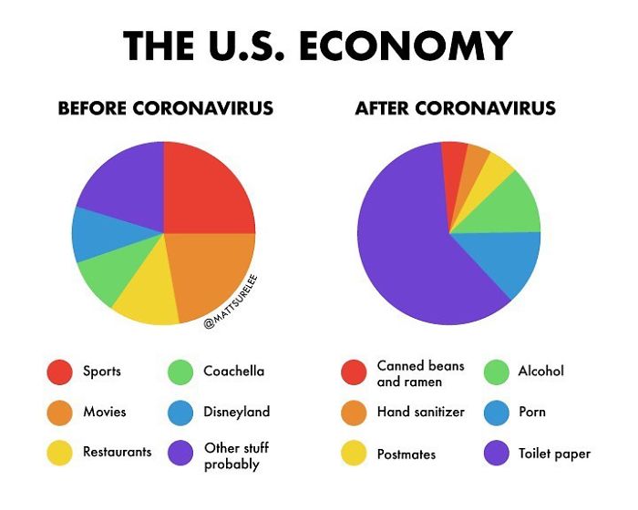
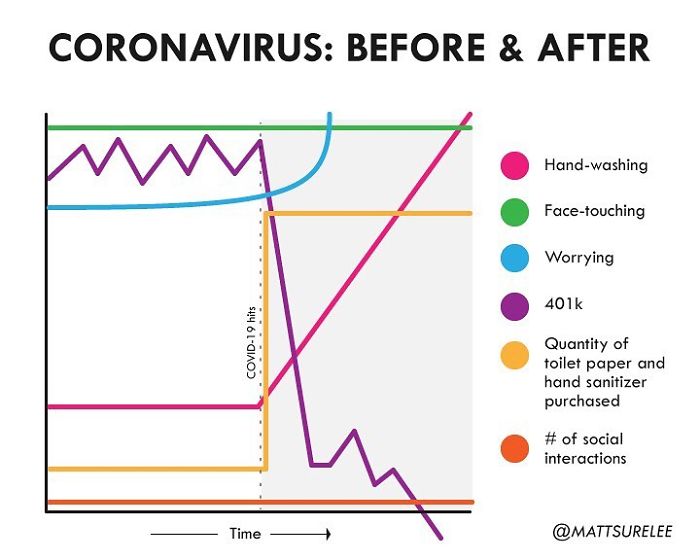
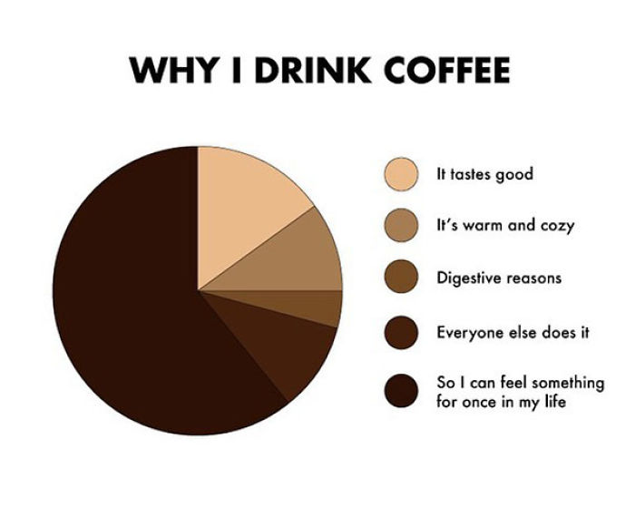
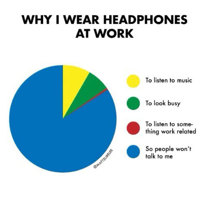
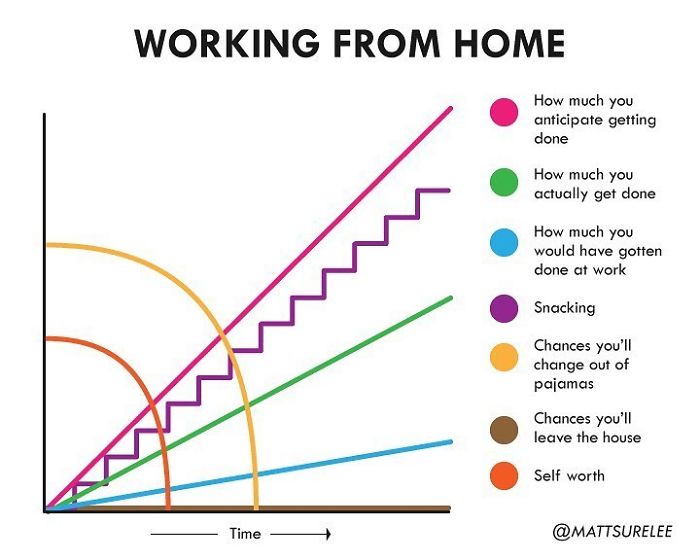
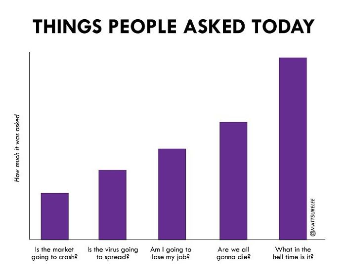
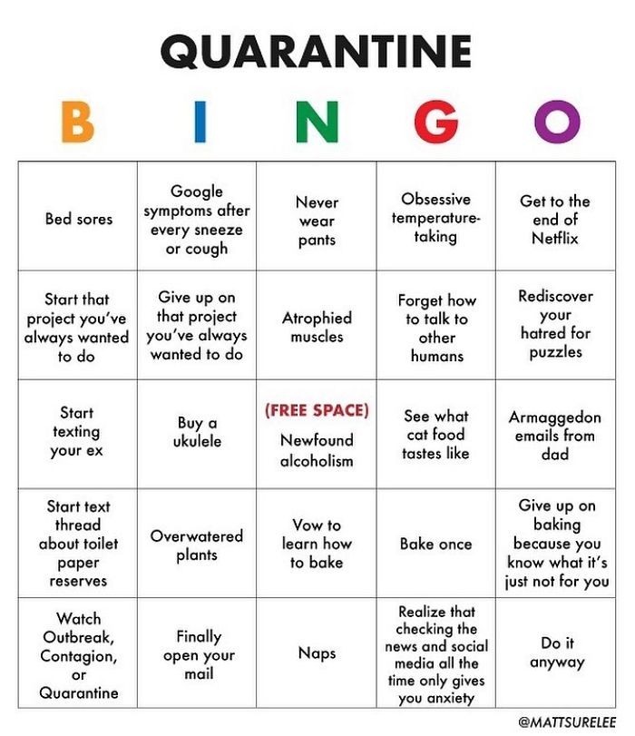
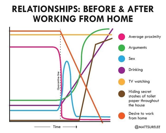
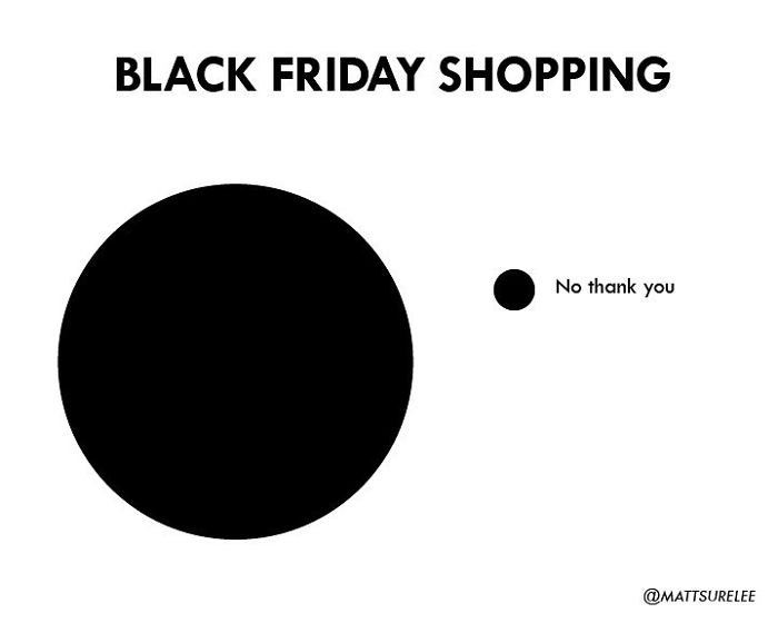
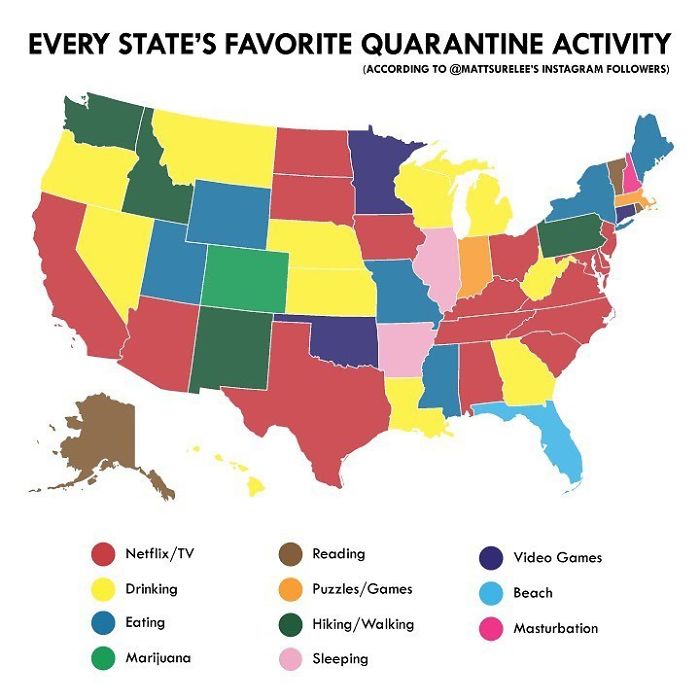
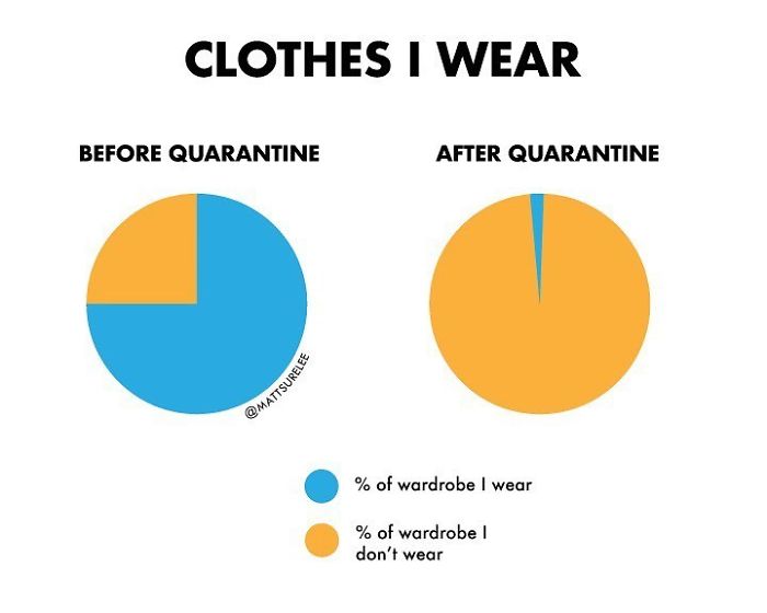
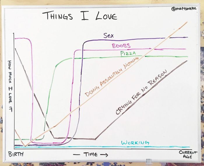
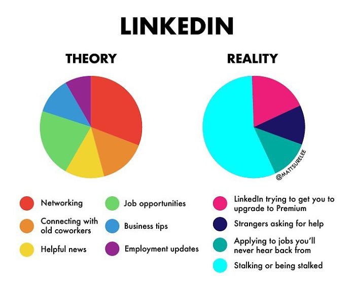
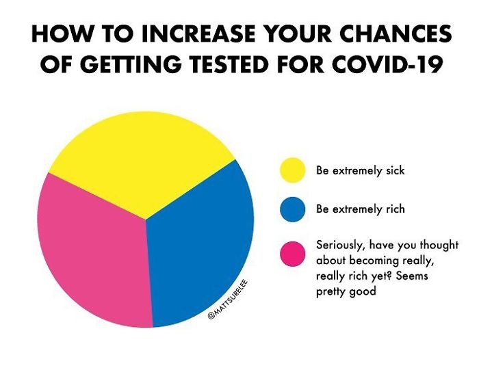
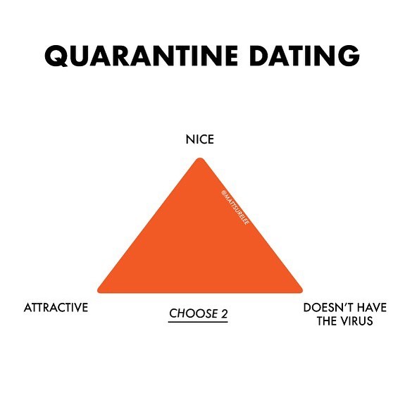
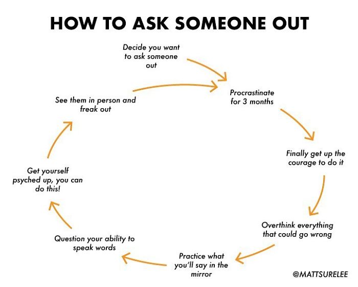
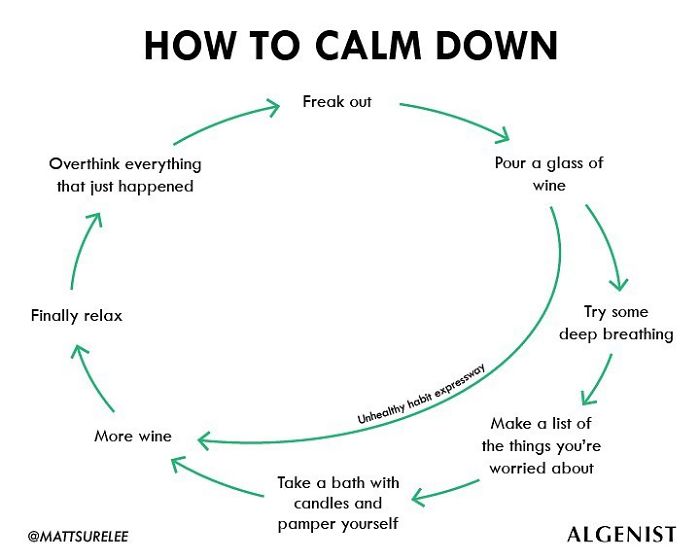
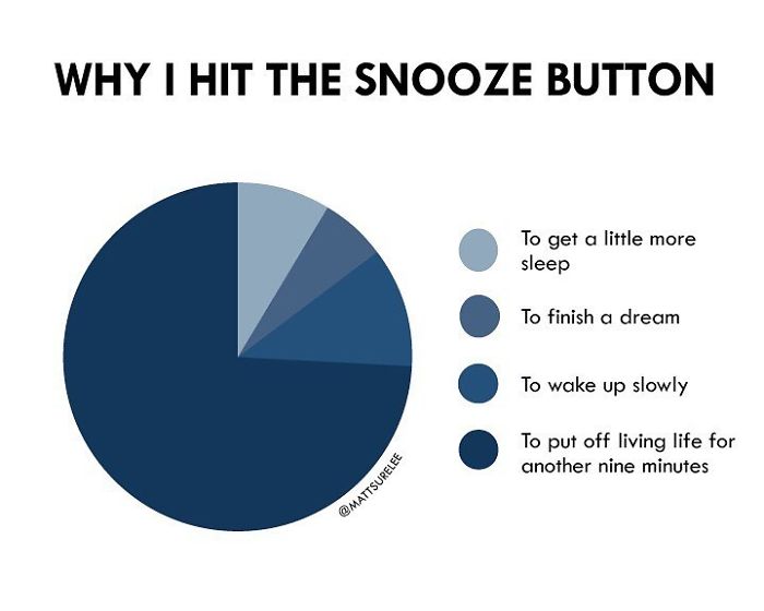
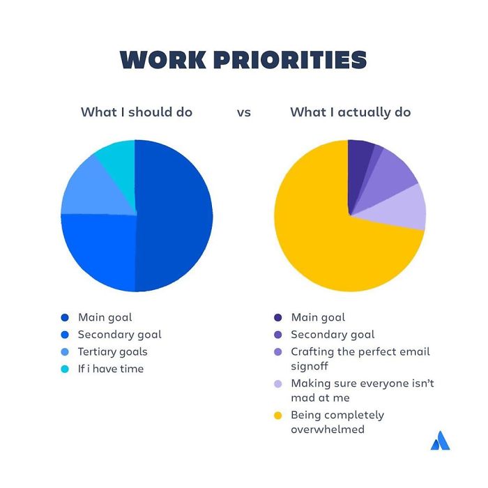
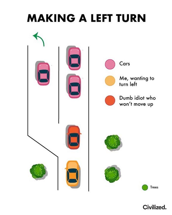
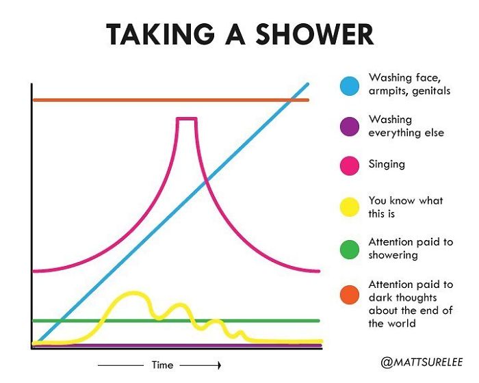
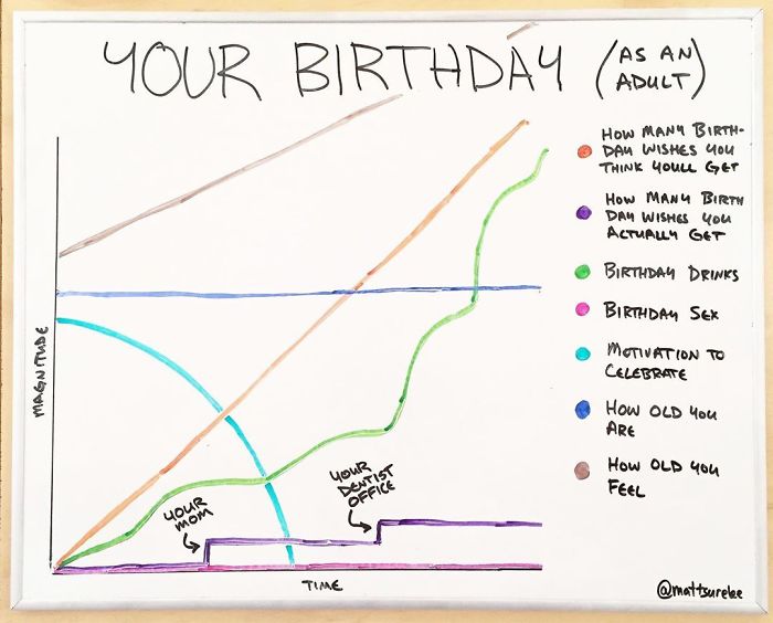
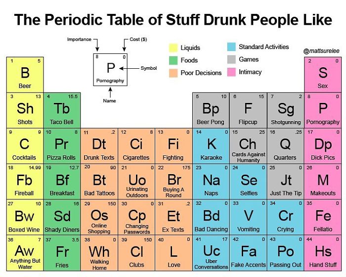
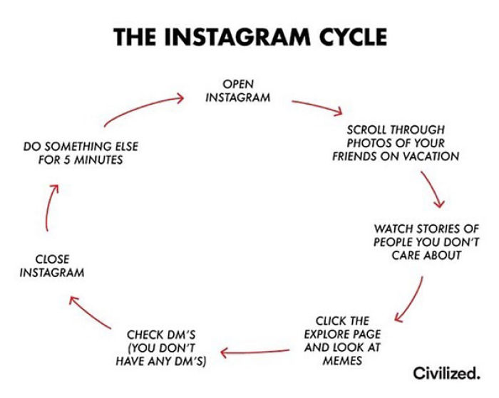
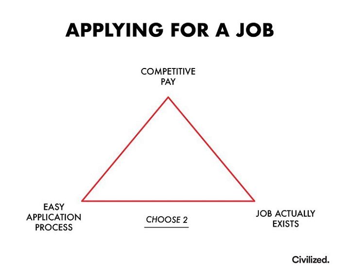
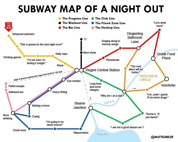
This guy named Matt Shirley has a playful solution. Every day, he shares a snack-sized bite of infographics that perfectly summarizes the current situation. No matter the quarantine activity—binge-watching "Tiger King" or working from home, the graphs have it all summed up. It may feel a tiny bit too relatable, but in the end, we’re all just a part of Matt’s hilarious statistics.
After you’re done with this article, take a look at Bored Panda’s previous posts featuring Shirley’s charts from the times it was all a little less hectic.




No comments